A distinct first impression.
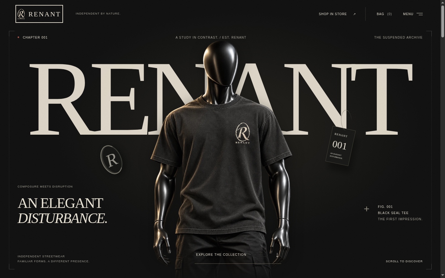
An oversized wordmark and a mannequin wearing Black Seal introduce the label before the visitor reaches the collection.
An elegant disturbance.
A scroll through the storefront redesign: the opening mannequin, a featured tee, the collection, and the story behind the label. These captures document the visual experience of this version.
The recording opens on the RENANT wordmark and a mannequin wearing the Black Seal tee. It scrolls to the Black Seal feature, then the Black Seal and Ghostmark product cards, the brand statement, and the first-chapter email signup and footer. It shows the page presentation and scroll sequence. Checkout, signup submission, and the separate 3D shopping experience are not demonstrated.
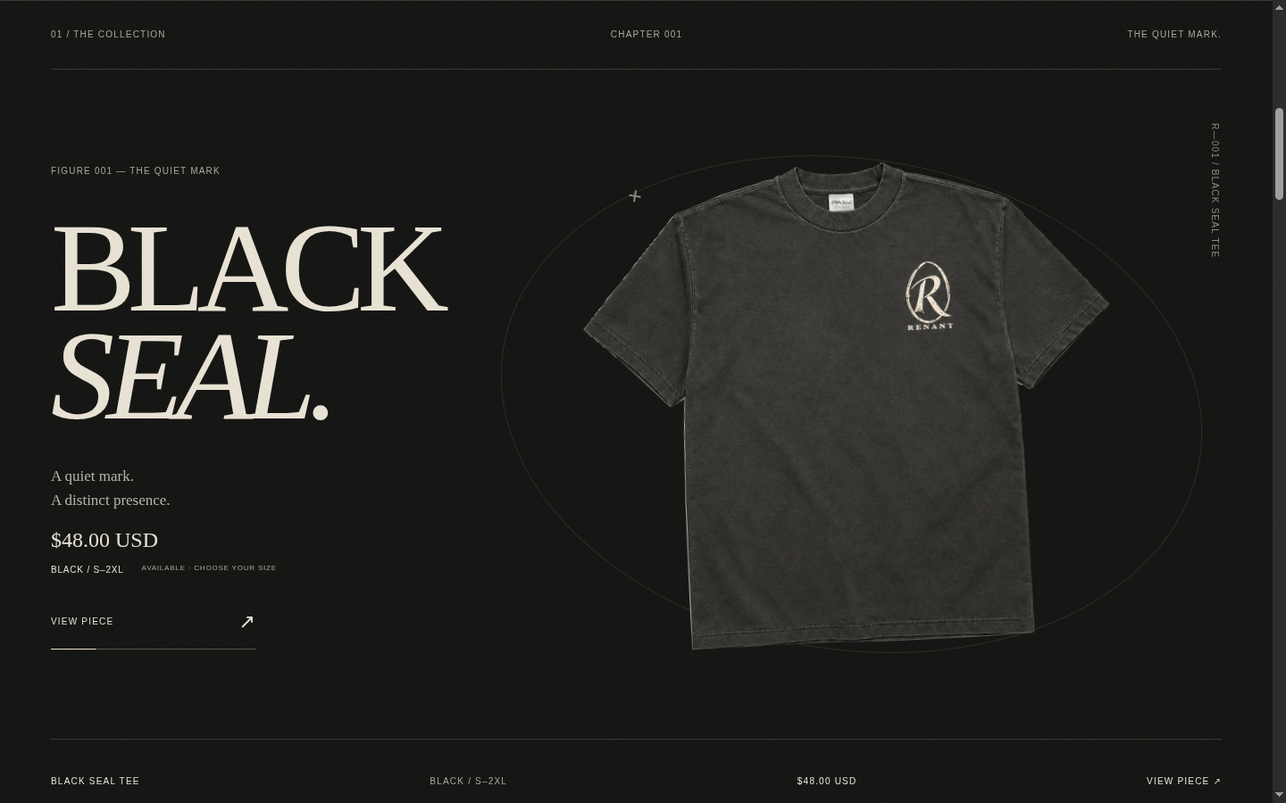
The Black Seal feature pairs oversized editorial type with a single product image. The product name, captured price, and view-piece action stay together in a restrained layout.
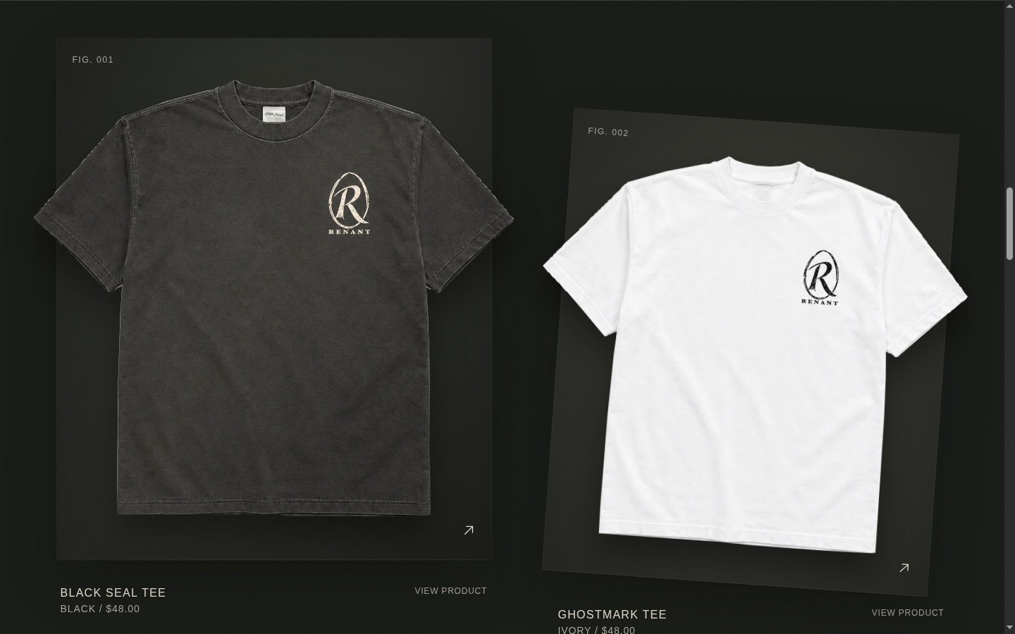
Black Seal and Ghostmark sit side by side in charcoal and ivory. Large product images, quiet labels, and a slight shift in angle carry the editorial direction into the collection.
I wanted the store to carry the same identity as the clothing: dark, editorial, and slightly surreal. The question was how to make the experience feel like stepping into the brand’s world.
I’m building the storefront around a clear visual sequence: a mannequin-led opening, an editorial product feature, the collection, and the label’s story. The visual world is as much a part of the project as the code.
The captured Chapter 001 redesign focuses on Black Seal and Ghostmark, carrying the label’s charcoal-and-ivory identity from the opening screen into the product presentation.
An oversized wordmark and a mannequin wearing Black Seal introduce the label before the visitor reaches the collection.
A dedicated Black Seal feature leads into the two-tee collection view. Large imagery keeps the product central, with names and actions close by.
Separate experiments explore a browser-based 3D store and a blackjack discount interaction. This walkthrough focuses on the storefront redesign.
This side project gives me room to connect visual direction with hands-on development and experiment with how a shopping experience feels.
Charcoal, warm ivory, and an editorial visual language give the project a consistent starting point.
The opening establishes the mood, the featured piece gives one tee room, and the collection leads into the brand story and signup.
The distressed R mark, restrained product labels, and large editorial type repeat across the storefront, giving each section a shared identity.
These screenshots and the walkthrough document the Chapter 001 storefront redesign. Visit RENANT for the current public experience, collection details, and release updates. Kinary Health remains my main focus.
Visit RENANT